02
The solution
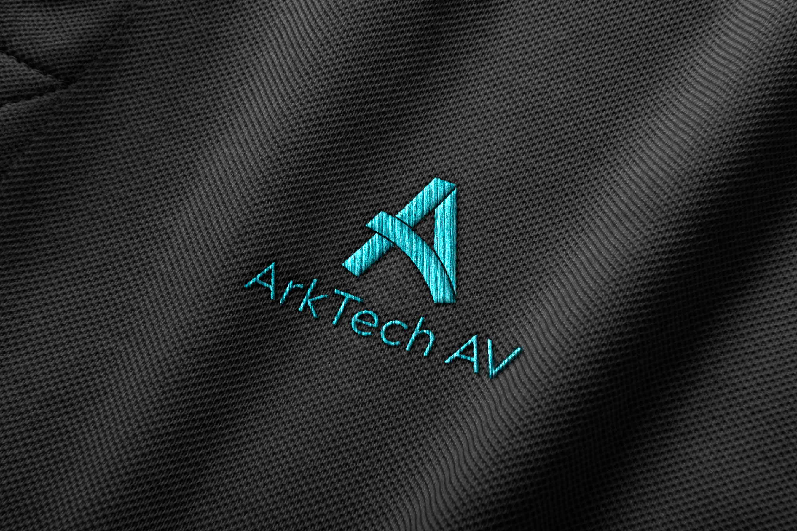
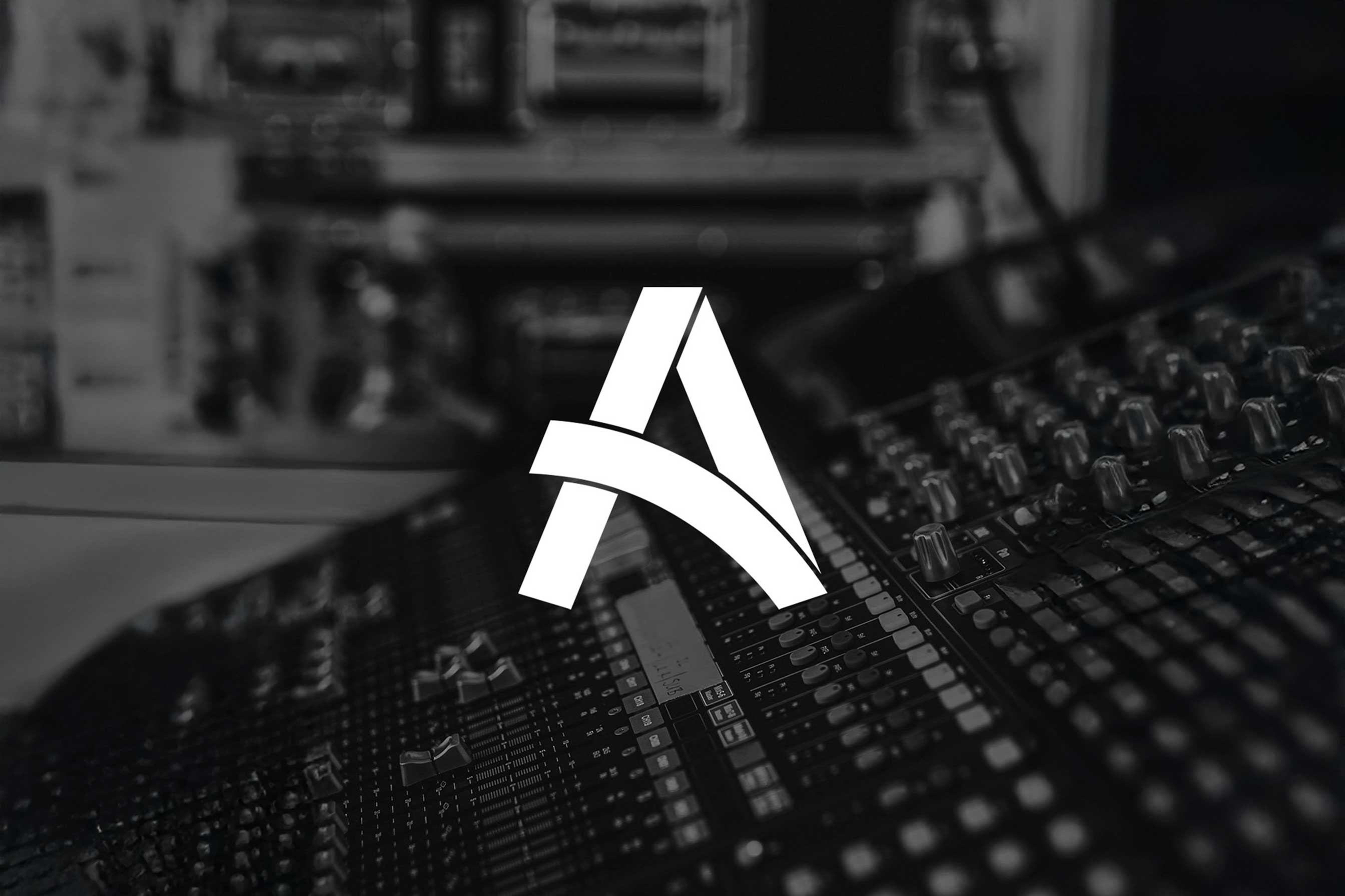
To better align the brand with their evolving team and ambitions, I refreshed their visual identity to create a stronger, more recognisable presence. I developed a considered brand mark and logo inspired by the company’s name and values. The new logo features a sleek, curved form that echoes the shape of an ark, paired with distinctive cut lines that nod to electrical tape, a subtle tech-inspired detail that ties directly back to what ArkTech does best: integrating technology in a clean and forward-thinking way. We evolved rather than replaced their bright cyan brand colour, maintaining recognition while elevating the overall look and feel.


