Oops! Something went wrong while submitting the form.
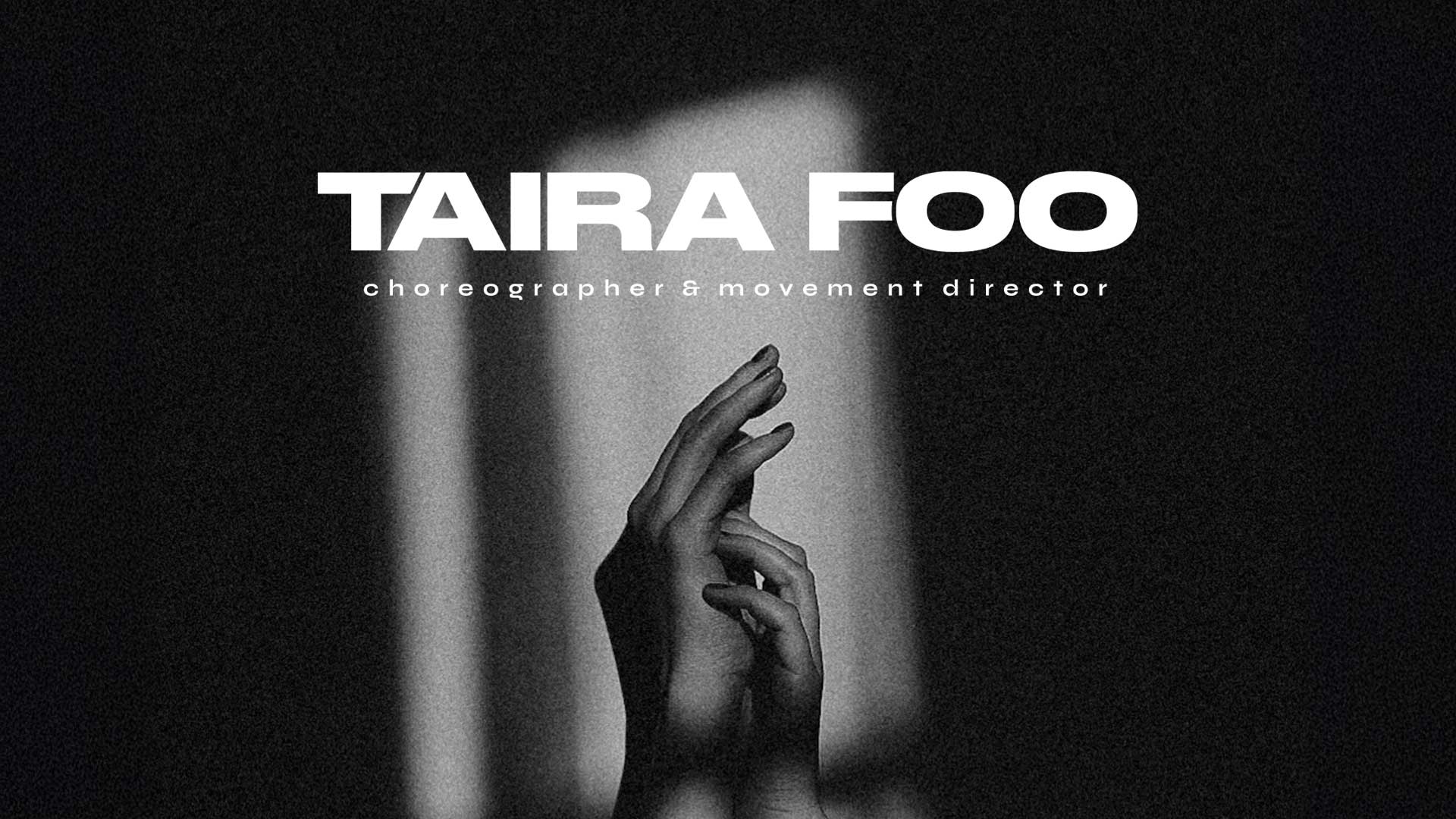
Taira Foo
Date:
Service:
Client:
Taira Foo
Branding | Website
Project Overview
Descritpion:
Taira Foo is a choreographer, movement director and founder of TF Dance Co, known for bold, emotionally charged performances that blend contemporary movement with striking visual storytelling.
Taira’s existing brand and website felt too uninspired and didn’t reflect the energy or personality of her style. She needed an identity with more edge, and a site that could properly showcase her evolving body of work.
02
The solution
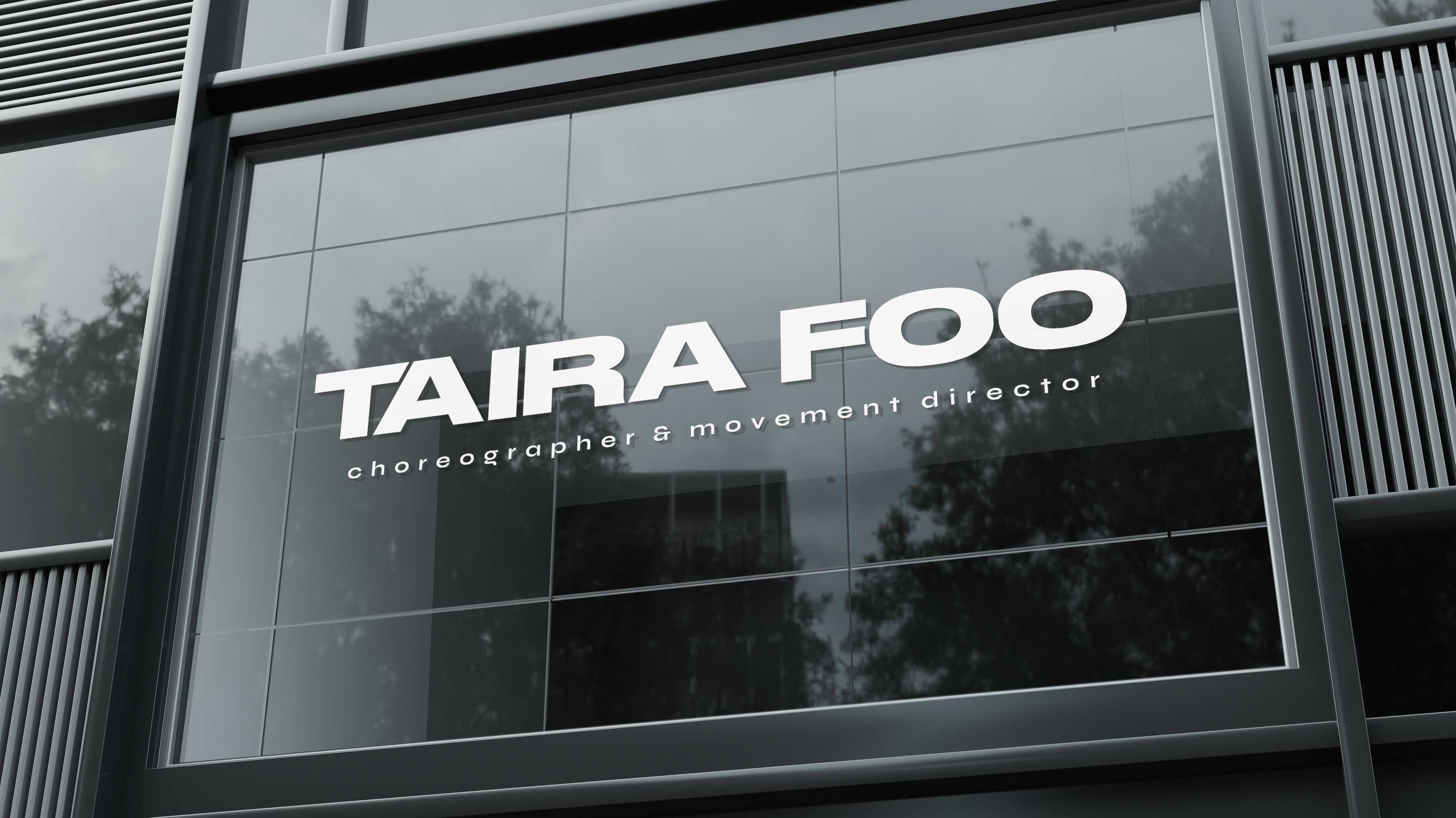
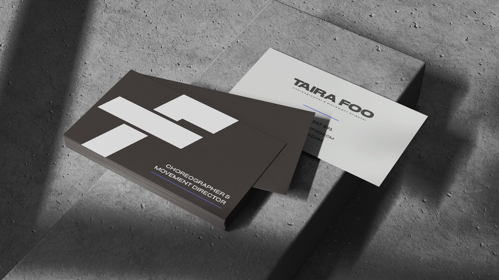
I redesigned the website to spotlight her projects, using clean layouts that gave space for bold imagery while keeping navigation simple and considered. For the identity, I crafted a custom word mark and brand mark using a bold, chunky typeface. The leaning “T” and combined “TF” nod to movement and balance, while a monochrome palette with accents of electric blue kept the brand emotive yet striking.
This balance of structure and creative flair mirrors Taira’s personal style and her choreography. The overall identity brings in creativity, boldness and structure with a designed to match the strength of the work Taira produces.
03
The outcome
Taira now has a confident, expressive brand and website that put her work at the forefront. The refreshed identity delivers clarity and impact, helping her stand out and make a lasting impression across the creative and performance industries.
Digital strategy
04
Lorem ipsum dolor sit amet, consectetur adipiscing elit. Nulla nec sapien,